


The Real 2008 Election Picture
From Mark Newman, Department of Physics and Center for the Study of Complex Systems, University of Michigan:
Election results by state
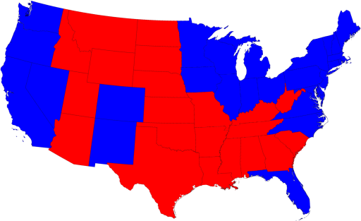
Most of us are, by now, familiar with the maps the TV channels and web sites use to show the results of the presidential election:
The states are colored red or blue to indicate whether a majority of their voters voted for the Republican candidate, John McCain, or the Democratic candidate, Barack Obama, respectively. Looking at this map it gives the impression that the Republicans won the election handily, since there is rather more red on the map than there is blue. In fact, however, the reverse is true – the Democrats won by a substantial margin. The explanation for this apparent paradox, as pointed out by many people, is that the map fails to take account of the population distribution. It fails to allow for the fact that the population of the red states is on average significantly lower than that of the blue ones. The blue may be small in area, but they represent a large number of voters, which is what matters in an election.
We can correct for this by making use of a cartogram, a map in which the sizes of states are rescaled according to their population. That is, states are drawn with size proportional not to their acreage but to the number of their inhabitants, states with more people appearing larger than states with fewer, regardless of their actual area on the ground. On such a map, for example, the state of Rhode Island, with its 1.1 million inhabitants, would appear about twice the size of Wyoming, which has half a million, even though Wyoming has 60 times the acreage of Rhode Island.
Here are the 2008 presidential election results on a population cartogram of this type:

Hat Tip To BentLiberal @ Docudharma
And on the flip: Palin's "real" America: From Larisa Alexandrovna at-Largely this morning...
Sarah Palin has told us over and over that she represents real Americans. So consider this very interesting analysis from New York Times, showing the areas of America that delivered more Republican votes than in 2004:
In comparison, look at the below map showing where there was an increase in Democratic voters:
Um, Sarah, looks like your real America is a tiny strip where mountain folk still dwell.


